June 19, 2021 9 minutes read
Top 10 UI Design Principles that You Can’t Afford to Miss
In this article you will find some key tips that helped me create better user experiences. Hope you will find them useful. Let’s dive into it.
June 19, 2021 9 minutes read
In this article you will find some key tips that helped me create better user experiences. Hope you will find them useful. Let’s dive into it.
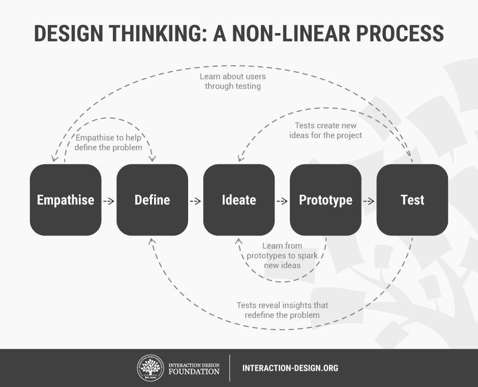
Whether is a client or an entire team that you’re meeting with, when working on a new project, you have to have a pen and paper to take notes. You cannot begin without understanding the people you are designing for. Ask questions, and find out what their needs, motivations, and fears are. Long story short:
This is the process every ux designer should follow. I strongly recommend taking a course or reading articles from these guys.
Ui Designers fixate too much on the artistic side of an interface and sometimes they hide features or push them below just for the sake of receiving validation and appreciation from a beautiful result.
On the other hand, ux designers don’t care at all about aesthetics, but rather on functionality. Anyways, I don’t know what’s the big deal with these two terms, so many people use them in the wrong context. Let me put it simply:
UI is part of the UX.
You cannot afford to say that I am more into the esthetic part of a product, neither that it doesn’t matter how it looks as long as it works. Find the middle ground, but put functionality prioritar.
You have to come through every stage of the process and each one of it is equal important no matter what the order is. You will finally gain insights, learn about your users and offer them a solution to their problem.
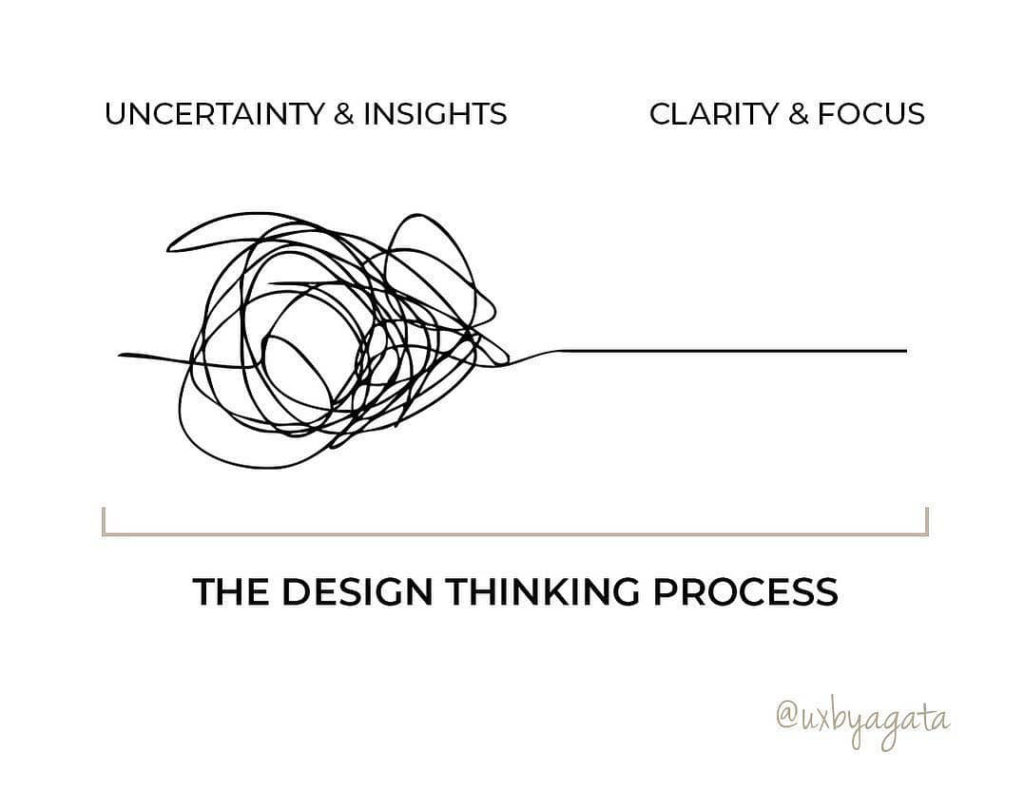
This one I’ve learned it the hard way. Late nights spent and failing in creating something beautiful and functional at the same time. Whenever I have this problem, I’ve got to take a step back and reflect on the idea, talk with my wife or a friend to liberate myself, or you can do any other activity that I love.
Projects come and go, you will fail some and win many others. Knowing how to balance and understand yourself in the creating process is key, and over stressing with the thought of failing will not be productive or healthy on the long term.
Whenever you feel overwhelmed with a complex task that you don’t know how to solve it yet, just do this:
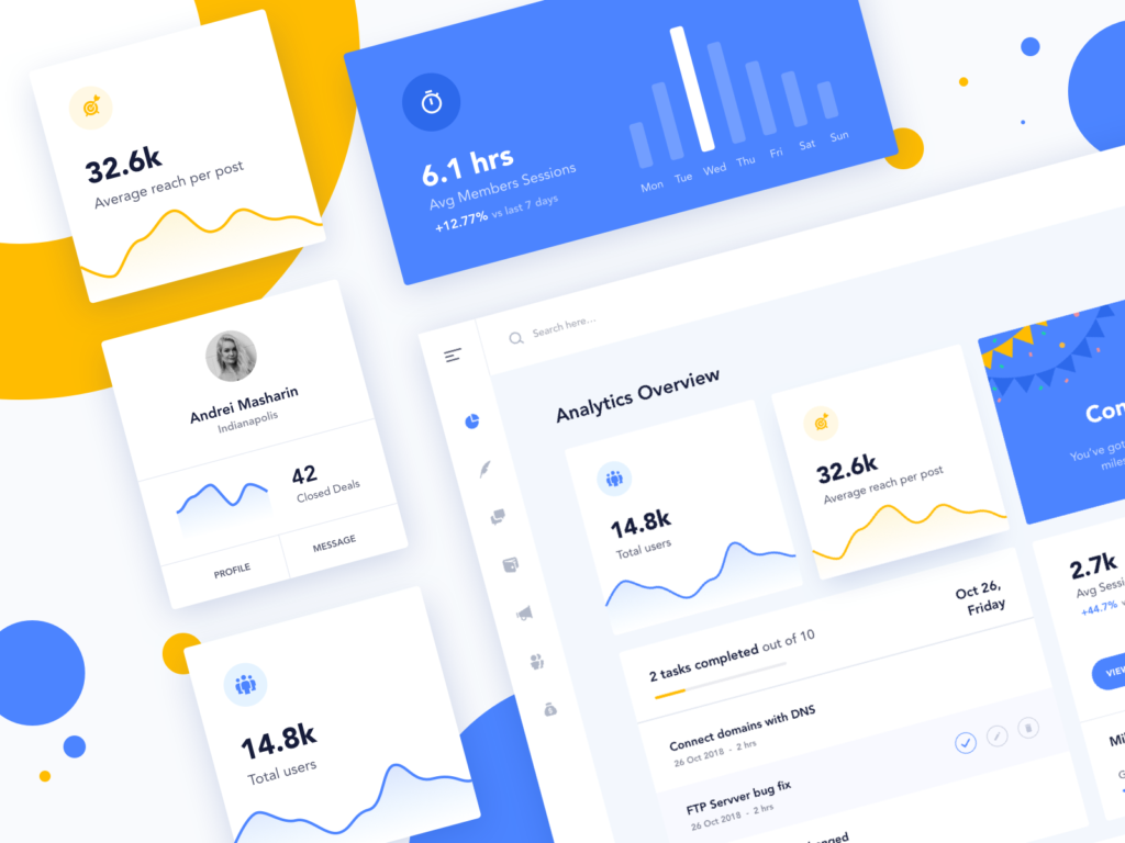
A clean dashboard by Ayush Jangra
Even if you end up with a complicated design that has multiple features on it, you still can make it look simple, yes you can. This situation is called featuritis. First of all, who says design it’s easy? No one in the right mind, I hope.
If you’re working on a large enterprise, a product becomes complex with every release, and what seemed a clean and easy-to-use interface in the early days, is no longer available now. Only a tiny minority of expert users can fully understand its capabilities. We don’t wanna do that.
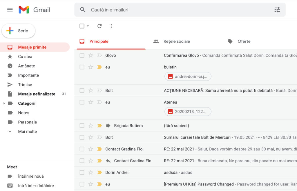
Let’s look at Gmail for example. What do we see here?
A lot of nav links, and some buttons, but somehow the information is well structured, the layout is still balanced, your eyes feel comfortable and you get the message right away. Here’s a method they have used.
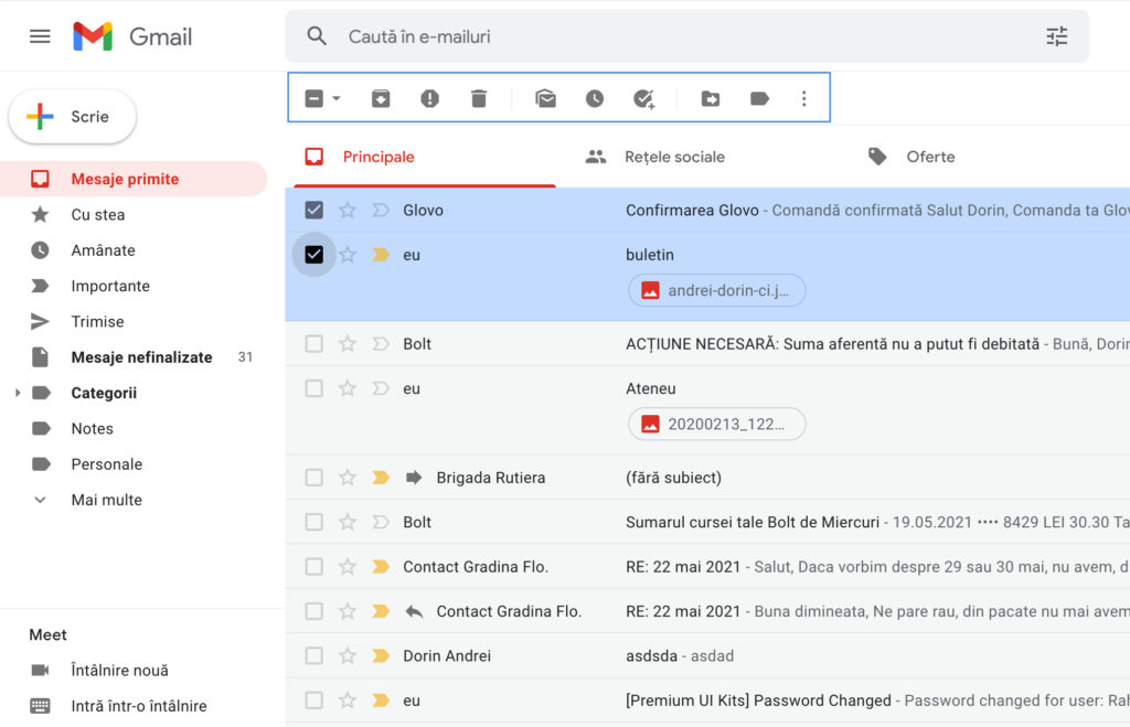
Displaying options depending on interaction, nowadays called progressive disclosure.
If we want to delete an item you can check the checkbox near to it and some action buttons will appear above.
Also, make sure your app has red routes.
I know that you might be thinking why I decided to start with them. We all know that the first elements that draw our attention right away are the images UI designers pick to create a great impact.
Believe it or not, they will do anything to match a high-quality photo with the chosen colors, that together depict a spectacular output among their work.
It doesn’t mimic the real-world apps that we use in order to satisfy our needs, but, when you make a presentation on Dribbble or Behance, it certainly does the trick. If you don’t know yet what I am referring to, let’s take a look at this example:
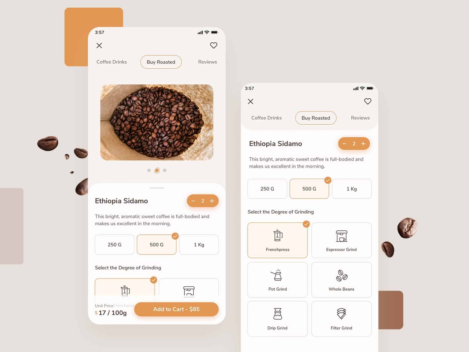
You can buy this UI kit from here
This is a mobile coffee concept that I have been working on lately. I don’t try to promote my shot, just that I don’t want to critique someone else’s work.
The accent color here is a combination of orange and brown or something in between. Its official name is Di Serria. Now, this color will go well with light cream, white, and dark brown, basically coffee colors. The images that I’ve used, have these colors in their composition, as you can see. Overall, it looks pretty clean, modern, and pleasant to the eye (can I praise my work, more?).
Let’s add an ordinary product image as we see in a live mobile app, where coffee shop owners don’t spend a lifetime picking the right photo and putting it together.
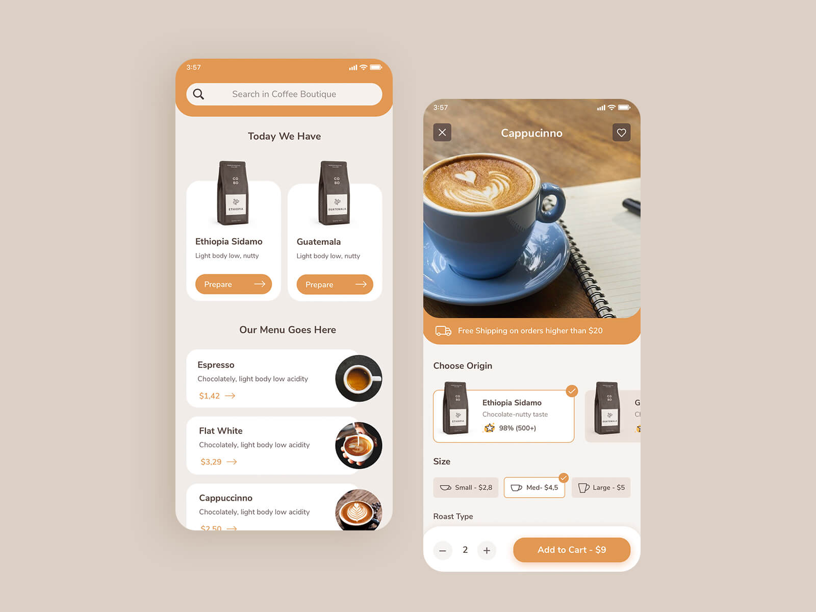
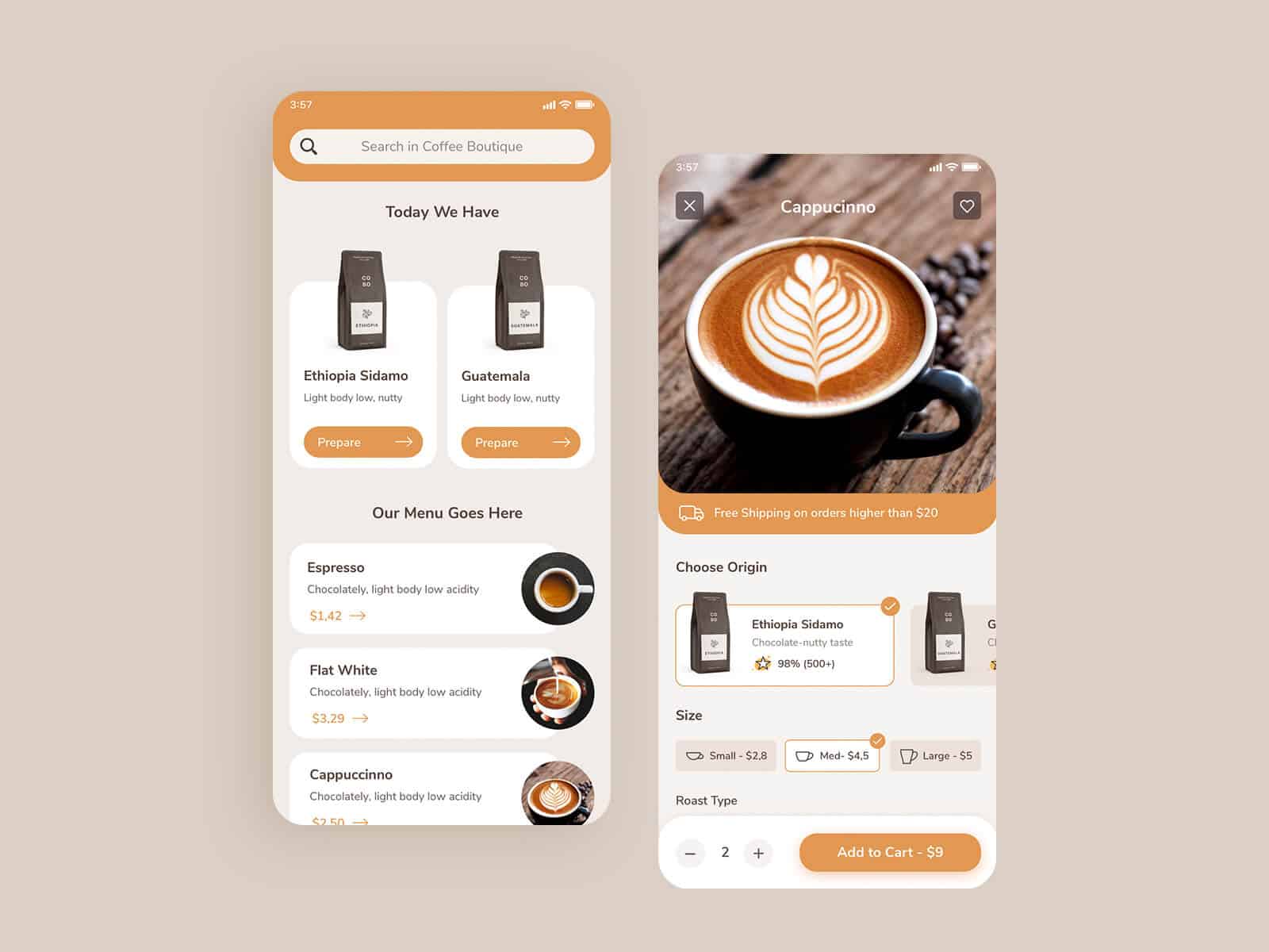
I think we all agree that the image on the bottom matches better in this particular case than the one on the top. The photos in both are great, but in my case, I will stick to the one on the right.
You don’t need to spend too much time finding the perfect image, as long as you prioritize usability over aesthetics you’re still on the right path. But why not usable and beautiful at the same time?
The details are not details. They make the design. Charles Eames
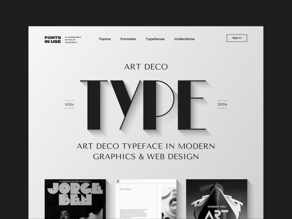
Amazing typography by Benjamin Oberemok
I want you to keep focusing on details. What else do you see when you look at a great design? First of all, how do you recognize it? Is it crowded? Of course not. Can you see long paragraphs crossing side to side, many font styles, with low visibility? I think not.
At first glance, a clean interface is well balanced with hierarchized and visible typography pleasant to the eye, that communicates well the purpose and the intent of the product/service.
A correctly built typography offers the base for creating a harmonious user interface. If possible stick with one or two typefaces in order to give your text unmatched legibility, clarity, and consistency through all of the pages.
We have a great article on how to make typography the right way.
I’ve played a bit on a mockup to showcase the difference between bad and good typography.
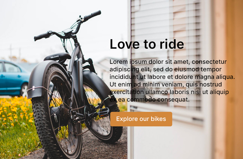
In the above photo, we barely read the paragraph due to poor contrast. Maybe a white bg underneath the entire content will increase readability. Let’s see:
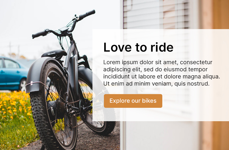
This is better in my opinion. As you can see, a small change can provoke a big difference.
I can go further and present some other tips for designers when dealing with typos, but this is a complex subject, so I strongly recommend this article.
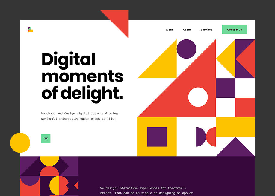
Designers often do anything to stay up to date with the latest design trends by adding that ‘spark of magic’ to their layout. I think this is ok as long as usability is not sacrificed for aesthetics.
There is a thin line we don’t want to cross when using these graphic elements that serve no purpose but to make a pleasant layout. We should delight our users with them, that’s why we should keep them ‘quiet’.
Before you add these details to an interface just make sure:
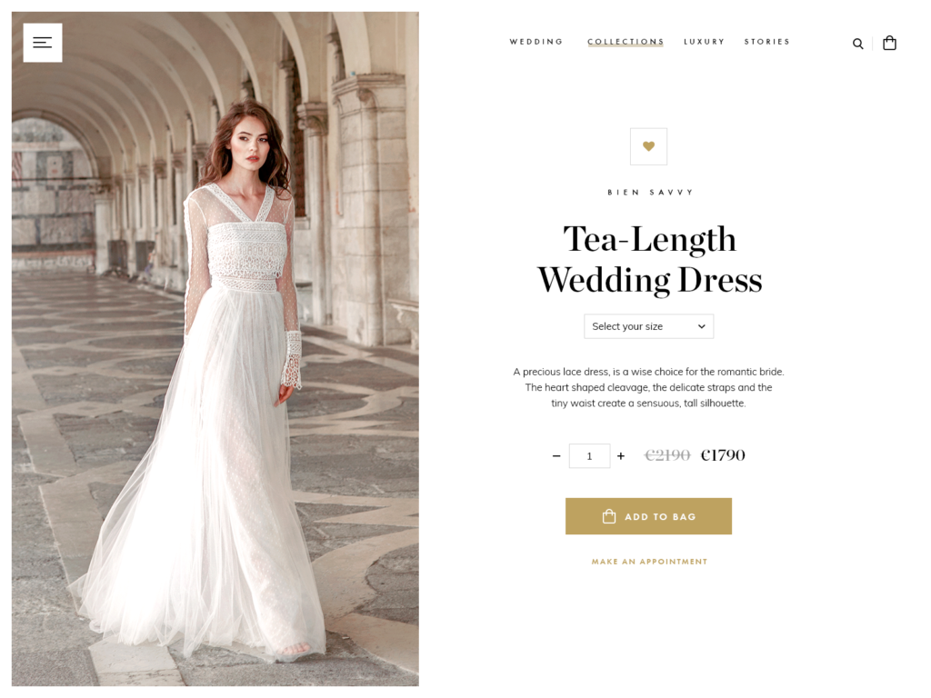
Another key aspect that contributes to a successful design is the white space or negative space. We all know how stakeholders and clients want to add complex features to their products in order to accommodate users’ needs. We still have to maintain that clean aspect.
According to Mark Boulton, the white space represents the empty space between the elements of your designed website.
Take advantage of your space by offering it real use and don’t try to squeeze or disperse your content. Find the middle ground; white spaces give an elegant and peaceful note which relax the eyes while emphasizing the main message.
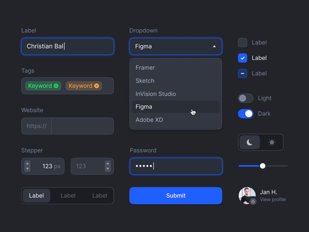
So many designers waste their time creating the same components over and over again on every new project. Consider using ui kits to reinforce your creative process, or create your own set of elements that create consistency throughout the pages and depict a better overall look.
You can reuse them on future projects by applying different styles. This is how you build a toolkit.
By using common elements and patterns that leave no skeptical feelings, users will feel comfortable and happy to use your product and will encourage their friends to utilize it. What this have to do with anything?
I see some designers trying to alter basic elements like buttons for instance. A button is still a button, with straight or rounded corners, covered by a simple color or a gradient. Don’t try to be too creative, you don’t want your users stuck, wondering what an element is.

Laboratory Illustration by Matus
Although I am not a big fan of illustrations, they are quite fancy & fashionable at the time. I can’t deny it.
Designers love to create all kinds of illustrations, especially 3D ones, with bright and vivid or warm colors, that convey a strong feeling of originality that makes your clients differentiate from competitors.
You can read articles, tutorials, and even books, but if you don’t practice a lot, all the information will be forgotten. You must strive for progress, not for perfection.
Don’t try to be a perfectionist, just try to be better than yesterday.
If you take a look at any designer’s work, start from bottom to top. You will see a history of progress, hard work, and dedication. There are no shortcuts.
In essence, creating a good design is something you can’t achieve in a month. Working in several companies, I have noticed designers at work and saw how they managed some of the challenging projects, and guess what, it always comes out to a human-centered approach. Behind every app, there are people, not users.
Continuous learning and practicing need to be a constant in a UX designer’s career. Doing ‘good work’ is not enough. You need to be curious and challenge yourself, step out of your comfort zone to become the best designer you could be.
How can you stay creative as a designer, when multi-tasking? Here’s what I’ve learned