Creating a positive spark when presenting yourself in front of your potential clients is an important aspect that you don’t want to mess up with.
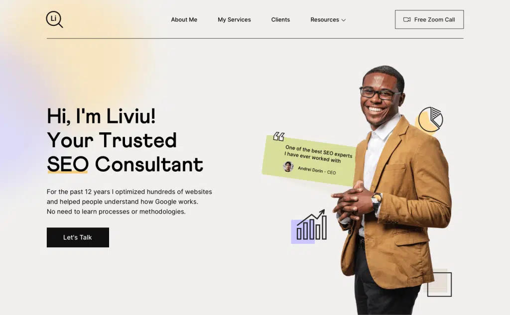
This layout represents a hero section, the top part of a website that allows freelancers to explain who they are, what they do, and how they can improve their customer’s lives.

The story behind this layout
A friend of mine is an SEO consultant from Bucharest, Romania and he is taking care of my website. One day during our usual meetings at a coffee shop, he asked me to create a presentation website that would help him express who he is, what are his services, and how he can improve people’s lives.
I said: “Of Course Liviu, I’m happy to do it.”
So I’ve opened up Sketch because back then Sketch was my favorite tool and I started designing. So, this layout is based on Bootstrap Grid, with 12 columns and a gutter of 30px. There’s nothing fancy here but a light-grey background and a dark typography on top of it.
What’s the secret behind a great design?
I think a combination of simplicity, huge typography, one accent color, proper negative space, and some magic elements that evoke a unique look & feel. And, I almost forgot, a bit of luck.
To see the document properly you need to install these fonts: Athletics Font Family and Inter
✅ 1 Web Screen
✅ 100% Vector & Easy to Use
✅ Customizable Symbols (Sketch)
✅ Fully-Layered
✅ Auto-Layout
✅ Resizing constraints


