The eCommerce industry is going strong, which is why the best practices of UX design matter more than ever. Now that mobile-influenced sales outweigh other types of sales, companies are going all out to improve their online customers' mobile and web experience.
Are you wondering why UX is so important for businesses? Camren Browne of CareerFoundry points out that many corporations are investing in UX designers because they can boost businesses’ revenue and help fulfill business goals.
So if you want to know why UX is important for business, here’s what you need to know about the benefits of good UX design:
1. Offers relevant solutions to customers
There’s a good reason why businesses are willing to invest in good UX design. Our ‘Complete Guide on How to Start a UX Design in 2023’ explains that UX is focused on a user’s overall experience, which is why the design process involves defining the problem, researching the needs of consumers, and even providing empathy to the consumers. Designers must understand the target audience’s needs to craft a design that serves as a solution to the consumers’ concerns.
To illustrate, a good UX design can reduce the number of steps a user requires to take in a website or an app before getting the information they need. As a result, users can save time while also fulfilling the task they need to do on the website or app.
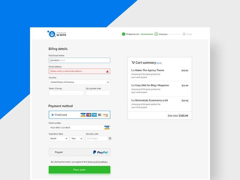
For instance, the checkout process is something we are all used to nowadays. The 2020 ARTS report showed that during the first year of the COVID-19 pandemic, online sales went up by $244.2 billion, making the total amount grow from $571.2 billion in 2019 to $815.4 billion in 2020, representing an increase of 43%.
The checkout process of your website is of critical importance in this situation. Nobody wishes to spend a significant amount of time filling out a form; it should be straightforward with concise forms, mobile-compatible, safe, and effortless to complete. Look at this design below in order to make an idea.
If you’re growing a business, SEO is an essential strategy that can help you gain more customers. Digital agency Ayima shows that performance SEO is one of the strategies that can help brands drive more traffic to websites. Though you can boost a website’s SEO performance through keyword targeting, internal linking, and backlinking, you can also further improve its ranking on search engines through a good UX design.
For instance, if a website with several pages only has received visits on the homepage and then users leave, that means you should rethink your content structure. When you look at Analytics, a bounce rate over 70% is a red flag because an ideal bounce rate would be somewhere between 20% – 40%. A number of factors can be responsible for high bounce rates, such as the ease of navigation, slow page loads, poor aesthetics, and bad UX. The goal is to keep users engaged, and willing to explore content and the benefits of the products.
In fact, Google and other search engines track the user engagement of websites and rank your business’ website based on the effectiveness of its UX elements. Websites that provide a good user experience can drive more traffic on search engines and potentially increase the number of new consumers of your business, which is why a good UX design business plan is a must.
3. Increases user loyalty
Apart from attracting new customers, your UX design can also increase the loyalty of consumers to your business. TechTarget explains that user experience can help you retain customers because it can effectively fill in the needs of consumers from your business. On top of that, an effective UX design can also offer greater performance to users, thus enhancing their loyalty to your business.
So even though your business may have many competitors, you can still attract more customers to your app or website by offering them quick access to quality content or simplifying the checkout process. This will keep users coming back for more, especially if your UX design is more effective and relevant to them than the others.
4. Boosts your conversion rate
A good UX design will not only attract new visitors and increase the loyalty of the existing ones, but it can also boost the conversion rate of visitors to your website or app. In fact, an article by UXMatters points out that a company that uses UX design to improve its customer experience can enhance its key performance indicators and return on investment. As such, even a 10% investment in UX design can lead to about an 83% increase in conversion rates.
The article by UXMatters explains that Amazon was able to achieve this by investing in the user experience of customers throughout their buyer’s journey. By regularly conducting A/B tests and updating their services based on data, they were able to create a UX design that makes shopping easier.
Conclusion
The success of your business can depend on the experience that you can provide to your consumers. So if you want to know how to improve your UX design, check out our design resources here at Premium UI Kits. We also provide premium mobile kits and web templates to make it easier for you to achieve business success.
Post written by: Leanne Sara Cooper for premiumuikits.com
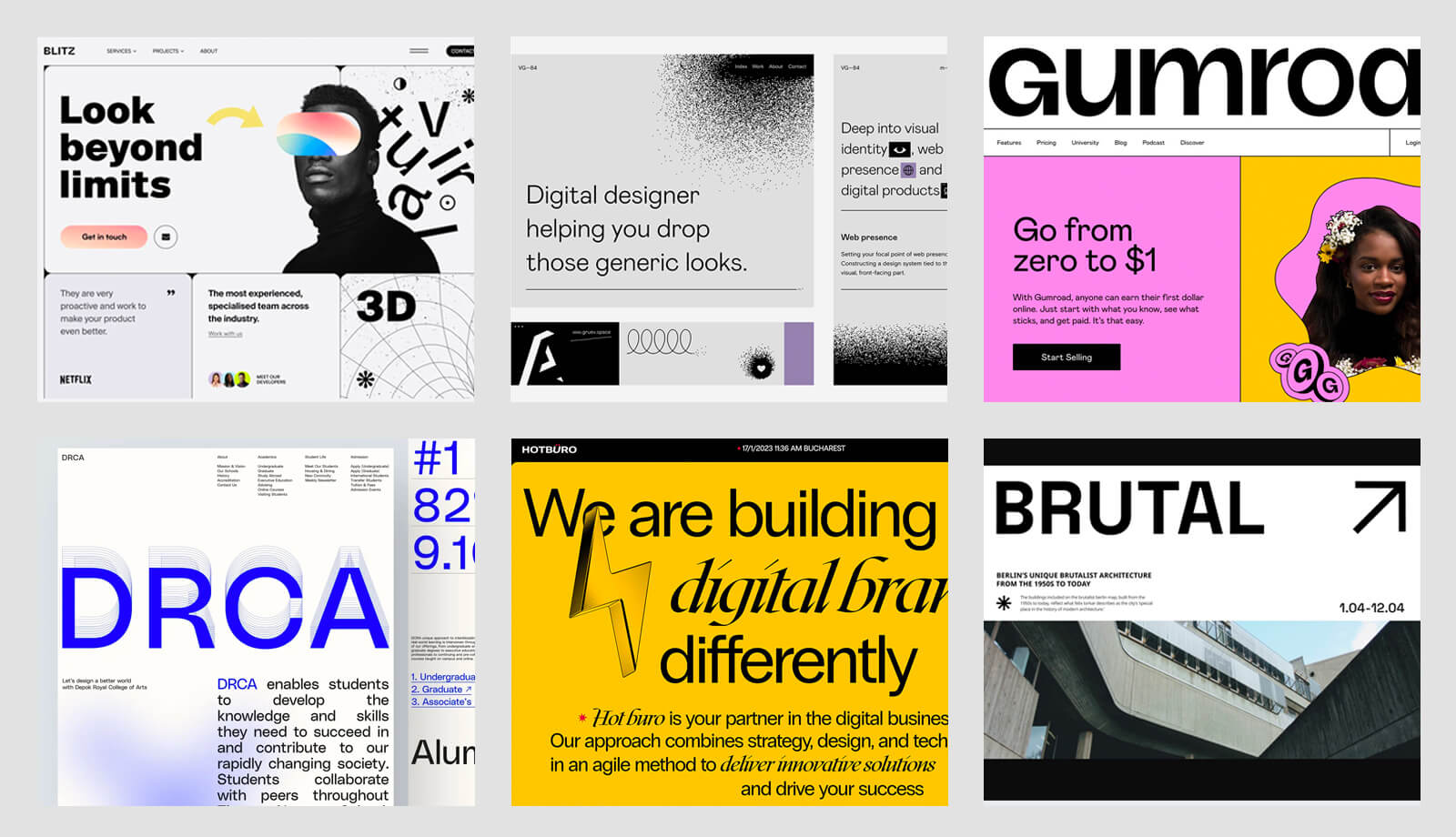
Neo Brutalism or Neubrutalism has been a hot topic on Dribbble lately, and it's easy to see why. If you're daring enough to try something totally different, this UI design trend is a great option. It won't let you slip away unnoticed; this aesthetic is bold, wild, and sure to stand out.
Whilst Neumorphism may have had its moment in the spotlight, this UI design style is quickly becoming the go-to choice for those who are looking to revamp their website or start a new digital product, because it is very easy to implement. Take a look at Gumroad, Figma, or Code Academy, to make an idea.
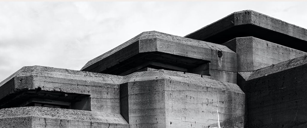
What is Brutalism?
The name “Brutalism” originates from the French word “brut,” which simply translates to “raw” or “uncultivated”. This architectural style was first seen in the middle of the twentieth century and became popular in the late 50s and early 60s.
#image_title
It features sharp edges, jagged shapes, rough textures, aged surfaces, asymmetrical natural shapes, and metallic hues. The materials used in this style of architecture are generally concrete, steel, glass, bronze, and iron.
What is Neo Brutalism in design?
It represents a UI design trend mimics the architectural style transferred to UI design through bold and huge typography, vibrant colors, strong contrasts with distinct edges, and solid background textures or patterns. That depicts a modern and distinctive output that promotes a better user experience.
Is minimalist a brutalist in UI design?
I think it’s an easy mistake to make, and only experienced designers feel the difference. It is possible for an interface to be quite minimal, yet still include the typical UI components of a new brutalism style.
Minimalism design involves incorporating as few elements as possible into a composition, such as a single accent color or no color at all, and no extravagant patterns or shapes. The overall effect is one of sophisticated and very uncluttered beauty. It is usually used for beauty websites, portfolios, or magazine websites.
On the other hand, the brutalism UI design style is quite different, with big elements that stand out, and brilliantly contrasting colors. Is something you will choose if you want to express creativity and amazing output. Let’s dive into more details. Keep on reading!
The Key Elements
We created a Figma web layout from scratch in order to accurately represent brutalism design aesthetics. We would like to demonstrate to you the progression of each element and its significance.
1. Shadows
We have been accustomed to the conventional soft shadows for many years, however, what we’re dealing with in this particular case is different; these shadows have full color, no blurring, and are positioned on both the x and y axes. You can apply them to buttons, cards, and ornamental elements.
2. Separators
Whether they be thick or thin strokes, the materials are all arranged neatly and the structure is organized correctly. Even with various separators, the entire look is still pleasing to the gaze.
3. Typography
It is evident that large titles can have a significant impact. They can be both unique and practical, and there will be no difficulty in writing CSS to incorporate them.
4. Colors
I know many people are not big fans of vivid contrasts through crazy colors, because of its lack of accessibility or readability, however, you can take this into consideration and even if you use pure black, it’s okay if you perform some tests.
5. Asymmetric geometric shapes
If you want to challenge a traditional UI design you can count on these for sure. You don’t have to create anything fancy, just a few circles, triangles, rhombuses, and diamonds. If you look carefully it seems that these shapes are floating around.
Are you tired of spending countless hours struggling with complicated design layouts and cluttered magazine templates? Creating a publishing website is hard we know, BUT WE’RE HERE TO HELP YOU. The main issue people face with traditional magazine templates is their overwhelming complexity and lack of visual impact.
We provide high-quality customization, specifically designed to suit your brand and needs.
No more hard-to-read layouts
Content is effortless to browse
Readability is increased even in the dark mode
Pre-built professionally responsive templates
FREE UPDATES
I hope this mini tutorial was useful for you guys! Now, we’ve got over 10 neo-brutalism web design examples that’ll give you a supercharge of creative motivation! We will keep this compilation refreshed on a monthly basis, so make sure to review it regularly. Have fun!
Let’s kick off this list with the inspired hero section of Vladimir Gruev’s designs. He is a massive admirer of the Neobrutalism style and has some great web design pieces. Make sure to check out his stunning work!
The huge typography, prominent separators, and unique angles all added up to make this artwork. It’s impossible to not take note of the extraordinary Ukrainian design squad at Halo Lab.
This website has a very distinct design, primarily because of the vintage background pattern used. The contrast is excellent, and all the elements appear to be authentic. The shapes, outlines, and one-of-a-kind font used for the headlines make it especially eye-catching.
In November 2021, the renowned platform for innovators was given a facelift and the Neo-Brutalism design was a smart decision to make. It is clear how the bright crazy colors and unusual shapes combine harmoniously.
It’s no surprise that the all-time favorite UI/UX design tool, Figma, has a presentation website that expresses the feeling of Neo-brutalism through big typography and playful shapes, outlines, and creative ornamentals.
Vibrant colors, cheerful expressions, humorous typography, in a nutshell, top-notch design! You can see how everything meshes well with each other, it really exudes a jovial atmosphere.
If you take a peek at the upper right corner, you’ll observe a trendsetting red shadow and an outline border, which is part of our UI styling. This website also has an attractive cartoonish look because of the lighting design and the unconventional arrangement of the typeface.
Even if it’s just an exploration we cannot disregard this fantastic design by Rayfan Tio Saputro from Dribbble. It is straightforward and tidy, yet out of the ordinary – the blue headline, the three-dimensional shadow, and the delicate radial gradient make it ideal.
This layout is strong due to its large typeface, which is essential to the design. It is straightforward and clear, with a well-defined visual hierarchy. Additionally, the main image does not have extra spacing along the sides, which adds to the overall look. It’s fantastic!
This website is incredible and I don’t usually say that. It stands out for its distinctive dividers, stylish font styling, and plenty of illustrations. It’s essentially a layout with photos and amusing mouse-over effects. It has a fun, stylish vibe, yet is simple to set up. This really brings to mind music festivals. Respect to the designers.
Bottom Line
Okay, guys, I hope this comes in handy for you. Even though we have arrived in 2024, individuals are still fed up with the standard website designs. My advice is to try something new; Neo-brutalism could be an ideal solution for this. Ultimately, this approach will enable you to attain a higher level of creative aptitude as a UI designer.
This Neo brutalism web design template is specifically designed to be compatible with Figma and is perfect for blog news publications. Through this freebie, users can quickly and easily construct webpages for publications that enable readers to locate content according to their preferences.
As the popularity and usage of Figma increases, so does the demand for free dashboards in Figma. Figma is a collaborative design tool that many companies, agencies, and individuals use to create digital user interfaces (UIs) from a single document.
In this article, we’ll provide you with some of the best free Figma dashboards ui. You can use these to streamline your collaboration, reduce design time, and make all team members more productive. Read on for more details!
Starting a UI design from scratch is appealing because everything is fresh and we have the opportunity to create something wonderful and usable step by step. However, we don’t need to reinvent the wheel by creating every element each time, which is why freebies can be beneficial.
We have collected some of the finest dashboard UI templates from global creative designers for Figma. We have considered how these designs are accomplished in a professional manner, with auto-layout, scalable vector graphics, typography styles, and color variables, among other things.
Enjoy!
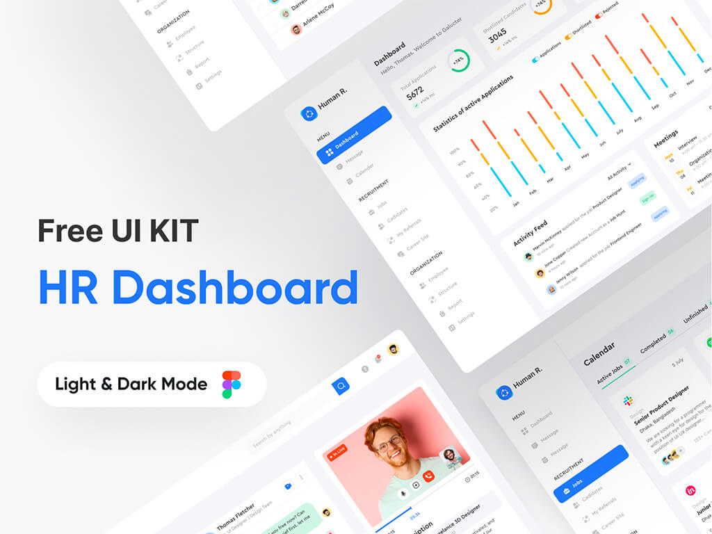
1. Admin Dashboard UI by Design Resources
Many of us are saved by this modern admin UI kit, suitable for human resource purposes. The layout is well-balanced and offers many ways to organize data. As you can see, the designer emphasized the center portion by giving it a lot of room because it is where the metrics, graphs, and most critical aspects of the user experience are found.
Download here
#image_title
What’s inside?
An organized Figma file
Components page
Header
Graphs: Bars, Radial(gauge)
Table
List of employees
Meetings card
Others
2. Dynamic Components Set by Julia Trut
This eccentric dashboard admin template is brought by Yuliia, an experienced designer from the heart of Ukraine. The diversity of the graphs and charts is so handy, especially for those who just started out in the UI design field.
Download here
#image_title
The entire work is very well executed using dynamic components, color variables, and predefined typography styles. If you want to change the colors of the charts, you should go to the components page and customize them with your own color variables and the entire document will update accordingly.
Overview
An organized Figma file with pages like
Components page
Dribbble shot
Playground (Instructions)
Graphs: Bars, Pie, Sliders, Radial(gauge)
Others
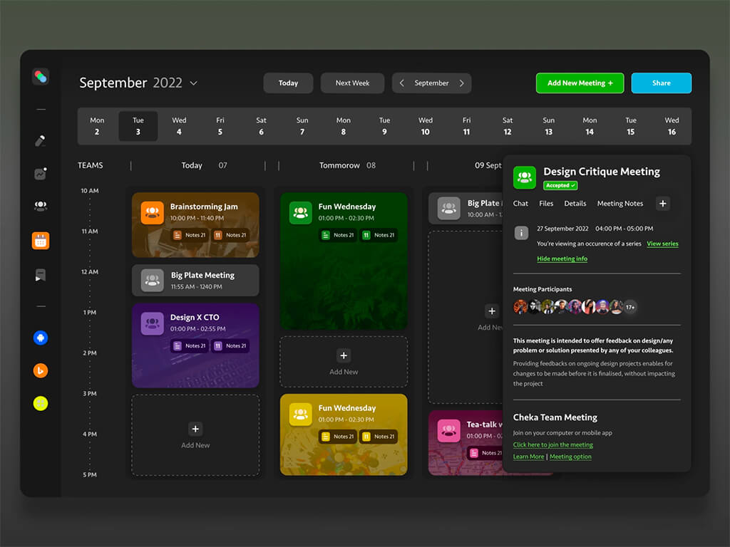
3. Manage Your Team Admin Template by Nickelfox
A beautiful free dark-themed Figma dashboard that mimics a user flow of calendar events and meetings throughout an entire team. The categorization among events is well distinguished each one having its own color.
Download here
#image_title
The whole design is self-explanatory with events occurring in a selected time period. A sliding panel with details is opened when clicked. You can add a new meeting by clicking on the green button, visible on the top bar.
Overview
An organized Figma design document
Font family: Seravek, SF Compact (install these first)
Colors & Typography detailed
Auto-Layout applied
Icons
More
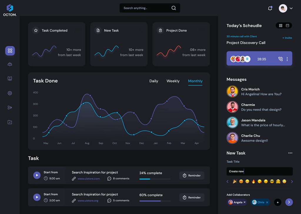
4. Task Management Dashboard by UI Store
Please welcome to this dark dashboard UI kit that provides you with the capability of managing your tasks with ease. This clean and minimalist free admin panel template will help you reutilize components such as line graphs, avatars, or sliders on your upcoming projects.
We opened up the Figma file and we found a well-crafted design with resizing constraints and meticulously layered. Big thanks to uistore for such a wonderful free dashboard UI design.
Overview
One Figma design document
Font family: DM Sans (install these first)
Resizing constraints
Outlined Icons
Line graphs with glow
Clean Avatars
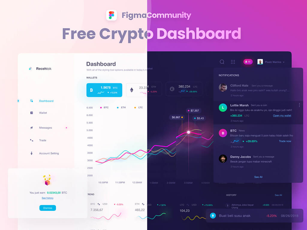
5. Free Light Crypto Figma Dashboard by Zazuly Aziz
The line graphs with glow and blur effects in this free Figma dashboard template by Zazuly go above and beyond the call of duty. They provide a futuristic look and feel that is perfect for cryptocurrency.
The padding on the sidebar between the nav menu icons and text conveys balance and clarity. This is not just a freebie to gain traffic. If we look closely, we can see the growth rate of each coin by these little line graphs, the status, and other helpful details that together build a useful design freebie.
Overview
Design compatible with Figma
Font family: Helvetica Neue (install these first)
Resizing constraints applied
Line graphs with glow and blur effect
Custom Icons
Well layered
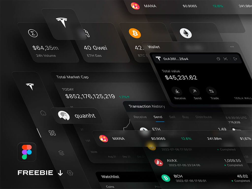
6. Dark UI Dashboard by Quan
Probably one of the best dark dashboard freebies in the Figma community, this design file will help you energize your creative workflow and saves you a lot of time. Quan did an amazing job by using white typography on dark grey. The output is original, and professional, with simple elements that mimic a real-world exchange capital market platform.
This complex free Figma design template has many widgets from which you can get your inspiration when dealing with difficult clients. This is more than just a freebie, so many thanks to David Pacilio.
Overview
A Figma file with 4 pages
3 Artboards
Font family: Inter (install these first)
Auto-layout applied
Custom icons from scratch
10 Widgets Components
100% vector
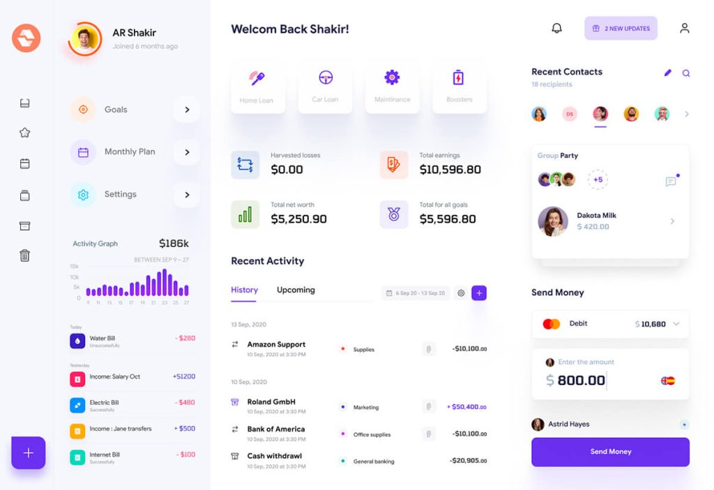
8. Finance Dashboard by Figma UI Free
Ar Shakir as always provides us with an amazing dashboard ui design template compatible with Figma. The overall design style is trendy and catchy having multiple features and widgets that you can inspire and apply to your own personal projects.
Download here
#image_title
The design relates to a user scenario and his current activity in the cryptocurrency mining market. This layout allows for an easy and new arrangement, thanks to its diversity and components.
Overview
One Figma file
2 Artboards
Font family: Googe Sans, Tomorrow (install these first)
Playful style
Custom colored glyphs
Lots of widgets
Meticulously organized
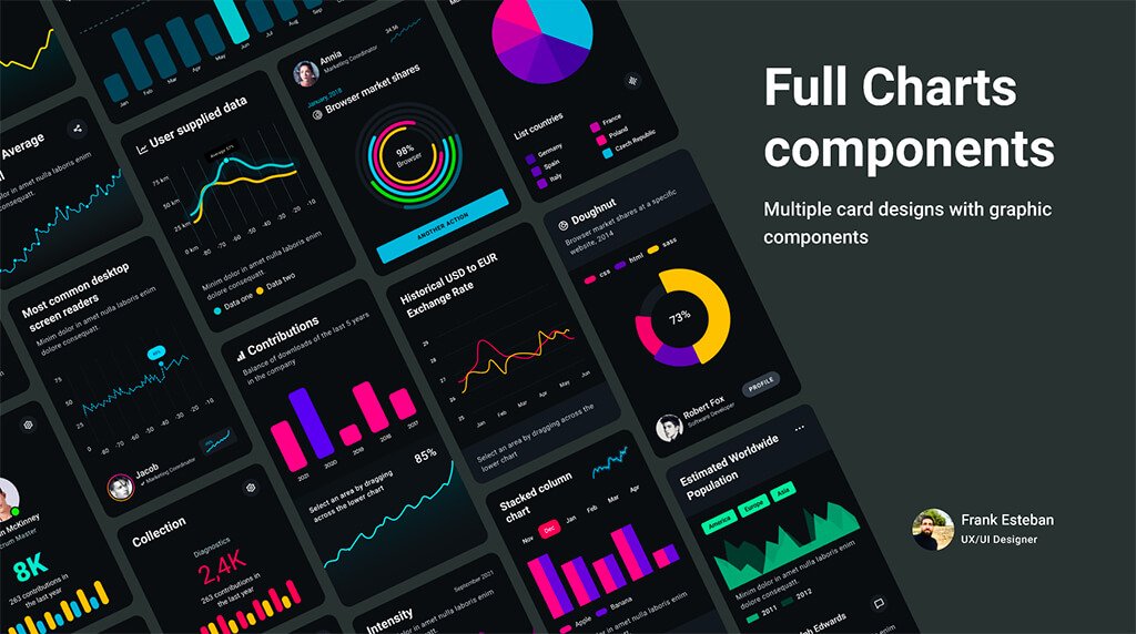
9. Full charts components by Frank Esteban Isdray
Introducing a wide variety of charts and graphs that boost your inspiration and reduce your time. The card system combines graphics and data to create an interface that works on any device, delivering a user experience in line with recent interface design trends.
Designed for light, dark mode, and monochromatic themes, Frank put a lot of effort into this and designed over 115 cards that you can grab for free and customize as you want.
What’s inside?
One document
3 Pages (Cover, Design, Component)
3 Artboards
Font family: Roboto (install these first)
Auto-layout applied
Lots of charts
Simple to use
10. Social media dashboard by Chlorophyll Lab
We all know how important is our social media movement, and that’s why a dashboard that displays your performance is paramount. It helps us stay informed and take the right decisions. If you plan to build an interactive admin UI, this design freebie for Figma might come in handy.
We downloaded the file and we found very good work with useful design widgets that we can use as we want. The dark blue shades used for backgrounds and huge typography make it looks so cool. Well done Chlorophyll Lab’s team!
What’s inside?
A Figma design file
8 Artboards
Font family: Overpass (install these first)
Auto-layout applied
Charts: Bar, Radial, Line
Filled icons
Two themes: Light & Dark
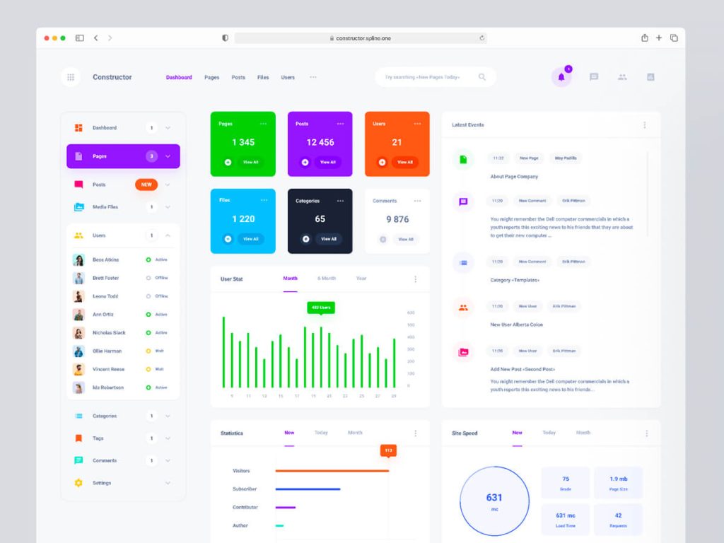
11. Dashboard UI CMS by Spline One
Cheerful by the vivid colors and yet professional, this free dashboard UI design for Figma is brought to you by Spline One. The layout grid has 12 columns by 64px width each one having a total of 1110px wide.
The usage of colors and icons makes us think of the Material design style. Inside you will find the mobile version of it, so this is very helpful. If you want to have usable freebies that work you should keep an eye on this amazing team.
Overview
One document
3 Pages (Cover, Design, Component)
3 Artboards
Font family: Roboto (install these first)
Auto-layout applied
Lots of charts
Simple to use
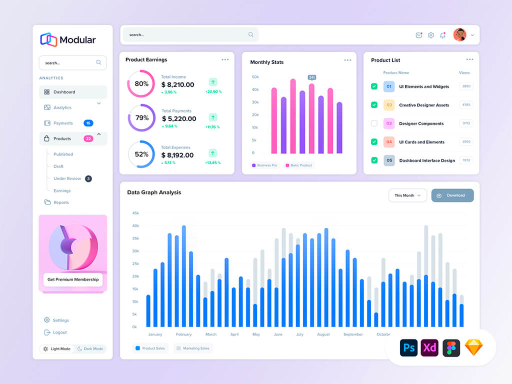
12. Modular UI Dashboard by KL-Webmedia
Another eye candy design is brought to you by the guys from KL-Webmedia. This file represents a free version of a modular design system that boosts your creative process and saves a lot of time.
The complexity of the sidebar nav menu is the primary feature of this admin panel. You can see how nested links are created with badges and states of all kinds that you can steal and alter to suit your needs.
Overview
Figma document
1 Artboard
Font family: Metropolis, Proxima Nova (install these first)
Auto-layout applied
Resizing constraints
Eye-candy colors
Graphs: radial, bar, line
13. Free Colorful Dashboard by Spline One
Another spectacular free dashboard UI kit for light themes is provided by Spline One. They used filled and light background colors for graph cards and it still looks good. Simple and clean, with all sorts of widgets and components, this dashboard UI design is for multi-purposes.
If you want to learn UI design the best way, you should get a copy of it and see how it’s done. The entire layout is uniform with white space used properly, subtle shadows, and beautiful graphs.
Overview
A Figma design document
1 Template
Font family: Inter (install these first)
Auto-layout applied
Wide variety of charts
Resizing constraints
Assets
14. Property Management UI Dashboard by Sauqi Arif
Get this minimalist free dashboard UI if you plan to design effective interfaces for your personal business. Even if there is no spectacular element and just a primary color, the output is quite original and fits real-world applications.
Huge thanks to Muhammah Sauqi Arif for this wonderful freebie.
Overview
A design document compatible with Figma, XD, and Sketch
1 Template
Font family: Inter (install these first)
Resizing constraints
Line chart
Unique icons
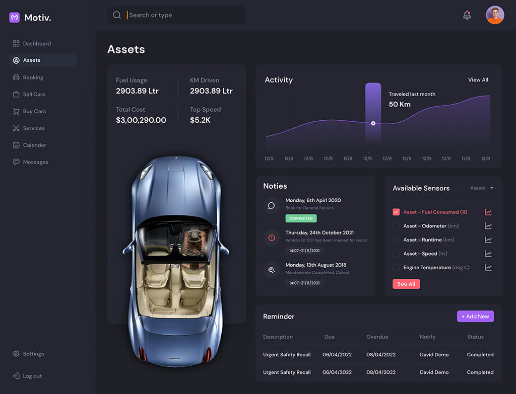
15. Car Dashboard by Rushit
The massive dashboard admin template consists of 20 artboards for light & dark modes with symbols, style guides, and typography styles. Everything is 100% vector and meticulously organized. We downloaded and played with it. Honestly, this is one of the best freebies we have ever seen.
Each component is under a modular approach from where you can grab and design at scale. Big thanks to Rushit, great work buddy!
Overview
A Figma file
Themes: Light & Dark
Font family: DM Sans (install these first)
Widgets & Symbols: Sidebars, calendars, events, tracking history, and more
Charts: line, gauge, bars
Well organized
Auto-layout
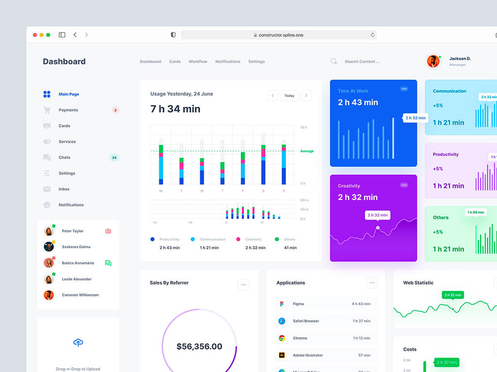
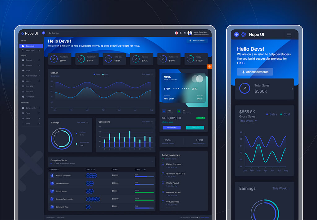
16. HOPE UI – Admin Dashboard UI Kit
An extensive admin panel template UI design, for light and dark themes with over 14 artboards that will help you accelerate your creative process and increase your inspiration. Contains artboards for flows like Sign up/in, Billing, Dashboard, Calendar, Pricing, Kanban, RTL Support, Timeline
The design is futuristic on the dark theme, and the contrast between the graphs and the background is very good. We encourage you to download this Figma design freebie and play with it.
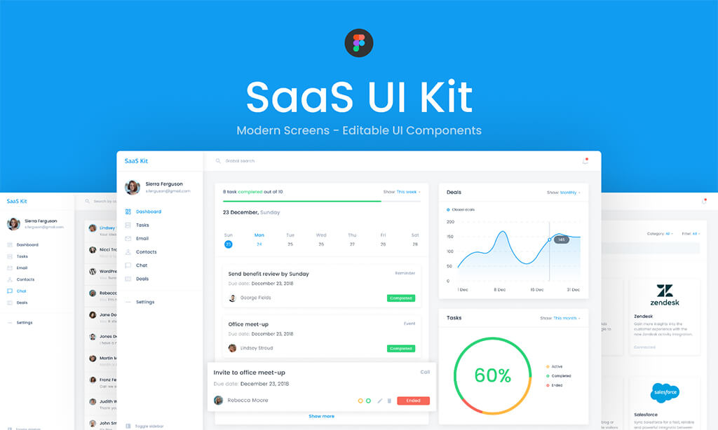
This Figma template provides a modern and clean dashboard UI with CRM screens and a style guide for easy customization. There are editable components, customizable colors, modern design, and more.
Download here
#image_title
Inside you will find screens like chat, contacts, dashboard, style guide, and text styles, all very meticulously organized. A good idea is to open up the file and see some best practices that you can apply from now on.
Overview
A Figma file
Themes: Light
Font family: Poppins
Artboards: 7
Auto-layout applied
Typography styles and color variables
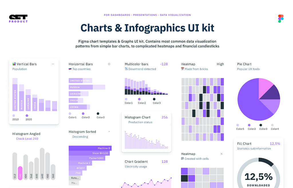
18. Figma Charts & Infographics UI kit by Setproduct
We all know the amount of time and struggle required to create charts from scratch. Every graph should have a design story behind it, with data that reflect the actual visual element where each color is a segment.
Download here
#image_title
We downloaded this massive design document and we found the right amount of everything. From simple bar charts to heatmaps and candlesticks.
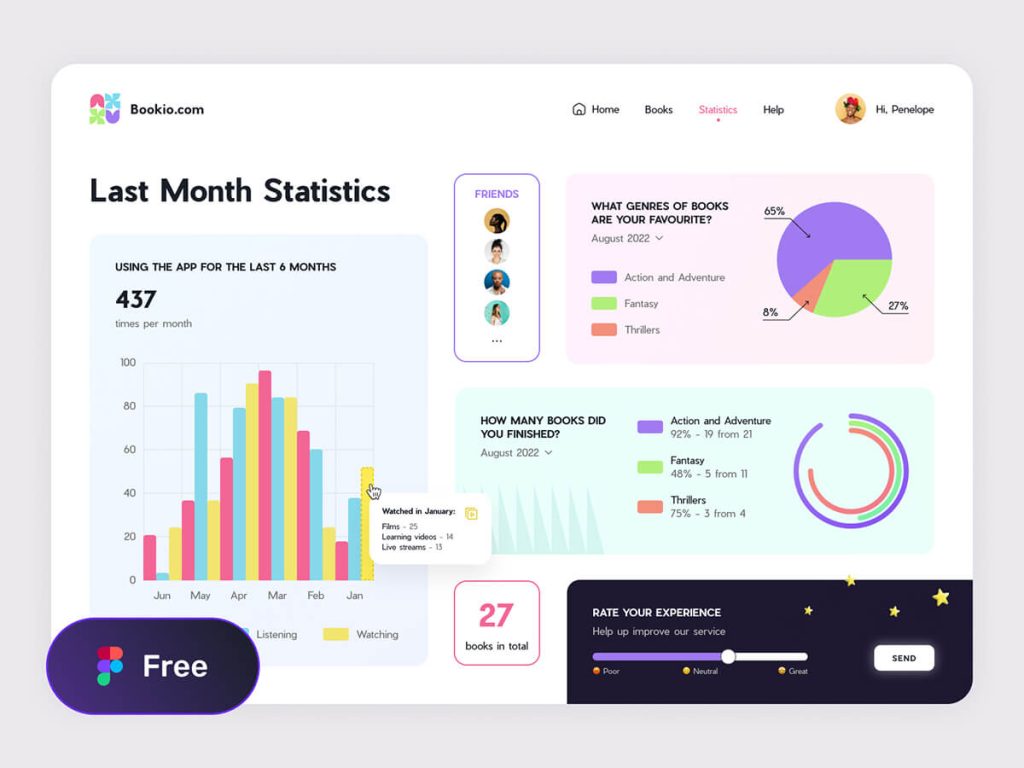
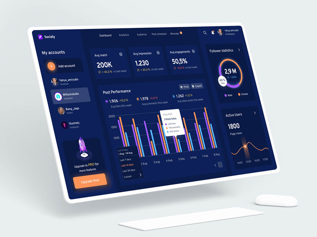
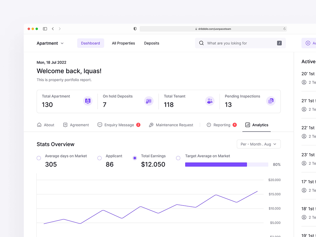
Do you want to create an eCommerce dashboard and don’t know where to begin? This Figma admin panel template can help you save time and expand your imagination. Within this file, we discovered interesting cards arranged in a unique way.
The freebie comes in light mode, with cheerful illustrations and vibrant icons that create a playful ambiance that you will enjoy.
Overview
A Figma file
Themes: Light
Font family: Montserrat (install these first)
Widgets: 11
Well organized
Resizing constraints applied
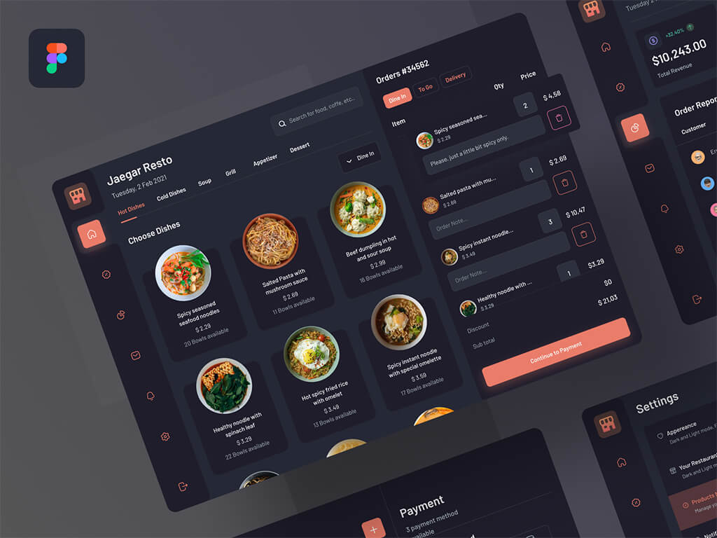
20. Food POS Dark by Yahya
This visually appealing UI design is perfect for restaurant owners or anybody in the food business. Keeping track of orders, income, and customers is crucial nowadays. If you desire to develop an effective CRM for your clients, you may learn from this example and then drag and drop components that you may customize.
If you open up the file, you will find an e-commerce flow that is very usable within three steps: shopping cart, choosing the payment methods, and finalizing the order.
Overview
A Figma file
Theme: Dark
Artboards: 4
Font family: Barlow (install these first)
Components wrapped in Symbols
Auto-layout applied
Final Thoughts
Great designers steal rather than copy, because as you may know, learning from others is a sign of intelligence rather than weakness. If you build effective modular interfaces, you will become an expert in your field much more quickly. Excellent clients will seek you out, and you may in the future be able to educate others about what you have learned along the way, so it is not about reaching the summit, but also about enjoying the journey.
We want to offer you a free Figma design resource that will help you create awesome user experiences when it comes to magazine websites. Meet Hypnosis, a clean and responsive neobrutalism article page that will boost your inspiration. Enjoy!